Tele2 — Self-Service Portal
Making enterprise self-service easier to act in without pretending the work behind it is simple
Enterprise self-service is not one journey. It is dozens of jobs, with different consequences.
A customer might arrive to trace an outage, follow an order, read an invoice, manage subscriptions or buy hardware. The portal had treated those as equal destinations in a navigation tree. The redesign starts with what needs attention now, then keeps the full account available underneath. The complexity remains; it is arranged around decisions rather than Tele2's internal structure.
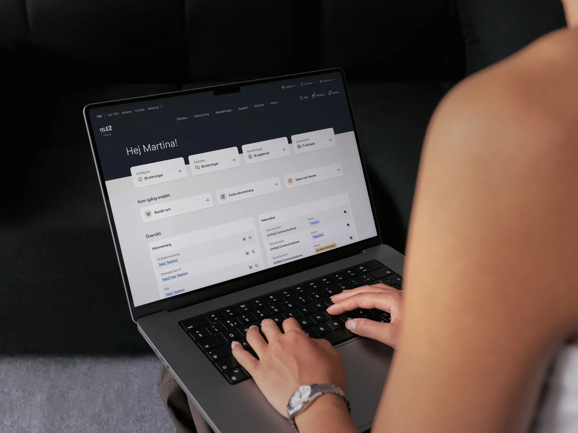
Urgency first. Frequency second. Everything else can wait.
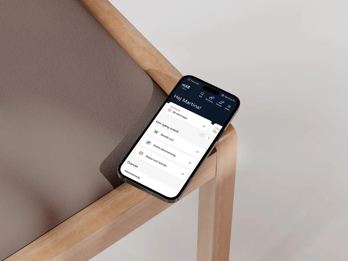
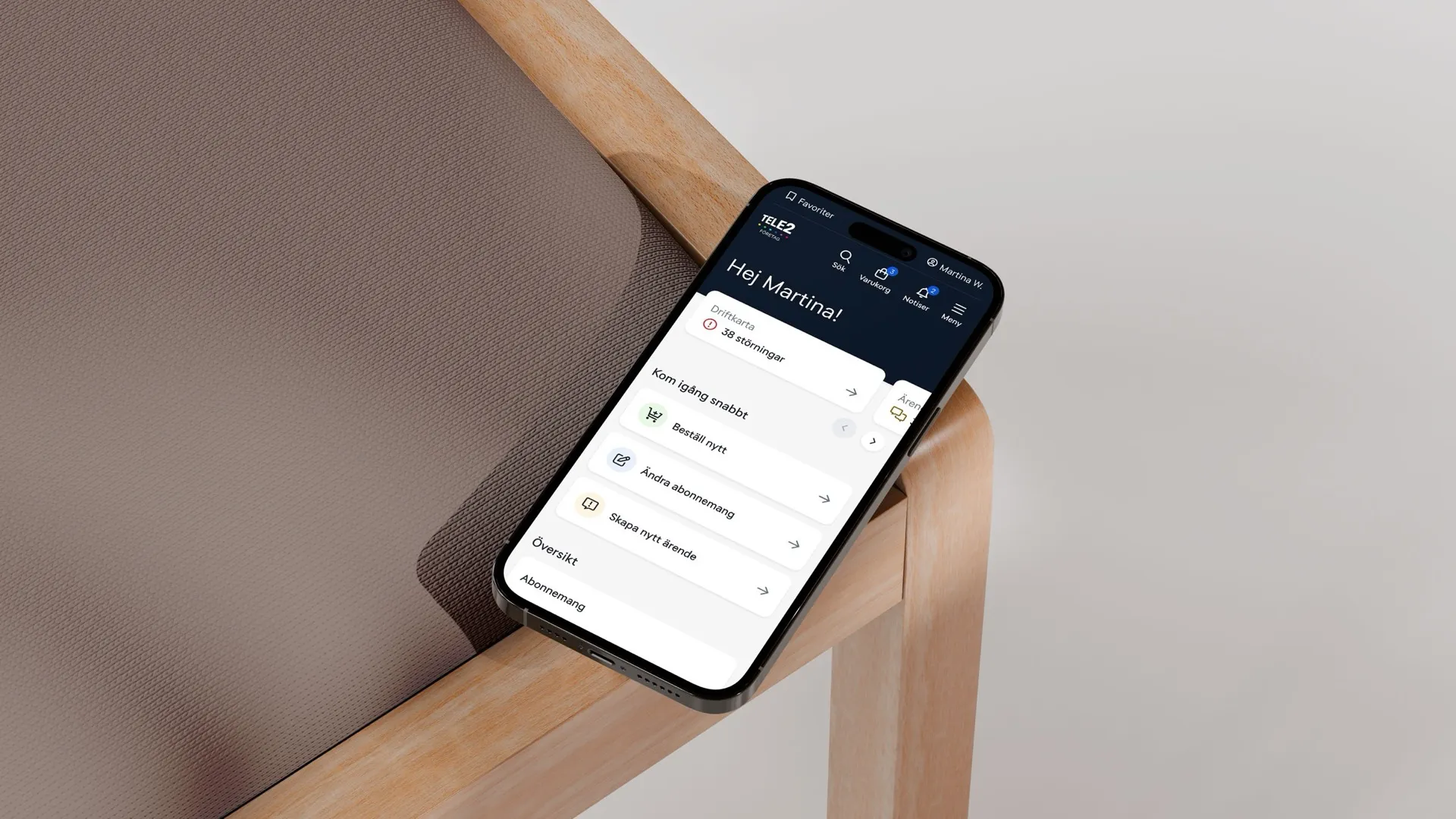
Operational status, open cases, orders and deliveries sit at the top because a disruption changes the working day. Common actions follow; subscriptions and agreements provide the slower account view beneath them. The hierarchy turns the home into a working overview rather than a collection of links.
Start with the product. Carry the contract rules quietly.
Product categories, filters, prices and availability stay visible together, so comparison happens before configuration. The interface carries enterprise rules without making the customer learn them first: start with the device, narrow the choice and add it when the decision is clear.

Dense where comparison matters. Quiet everywhere else.
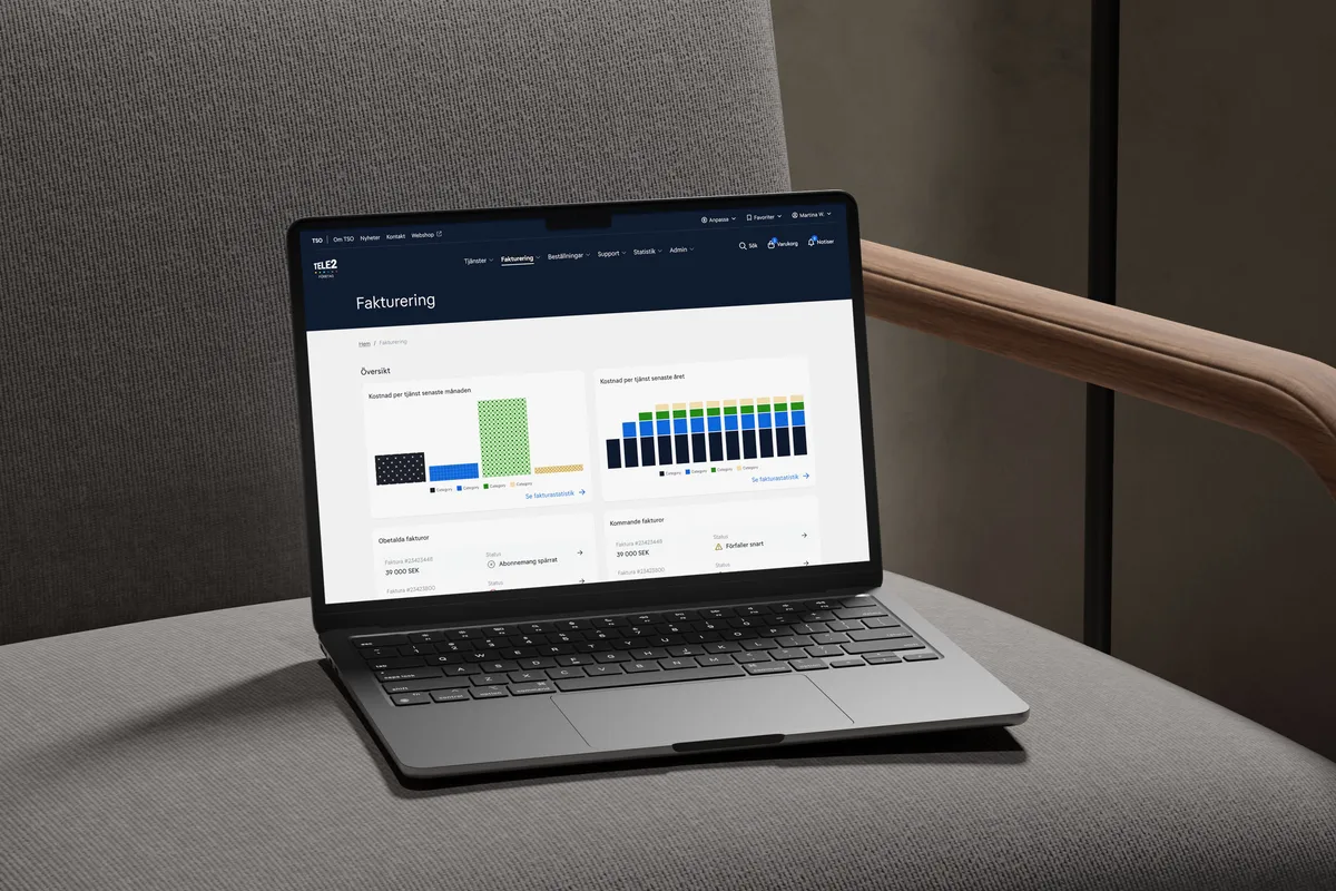
Billing needs trends, totals and exceptions in the same view; service administration needs many rows without losing status. Cards hold the summaries and tables carry the detail, with colour reserved for categories and things that require attention. Density becomes useful when every layer answers a different question.

Responsibility does not wait for somebody to return to a desk.
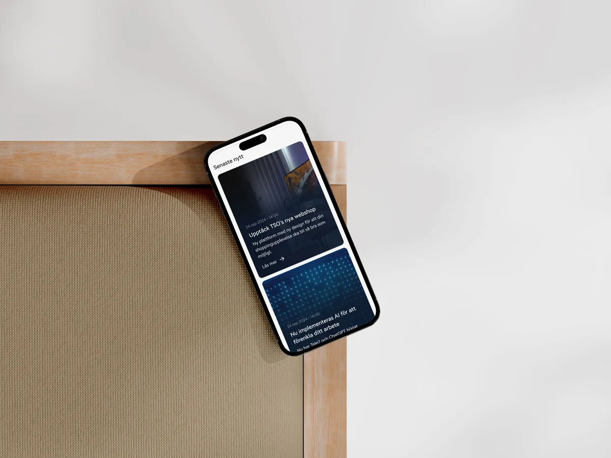
The mobile experience keeps service status and the next useful actions within the first screen, while broader content becomes a clear vertical feed. It is not the desktop portal squeezed smaller; it preserves the order of importance when there is room for only one thing at a time.