Sozo — Brand Identity
A complete identity for a furniture restoration studio operating in Sweden and Finland

SOZO rebuilds, restores and renews furniture in Sweden and Finland.
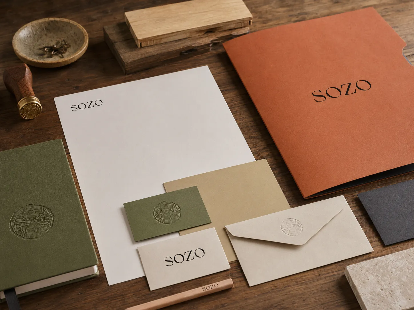
The identity was developed around the studio's focus on repair, material knowledge and long-term use. The system combines a high-contrast serif logotype, a tree-ring symbol, a natural colour palette and practical supporting typography across the workshop, retail space and customer materials.
A high-contrast serif wordmark for the studio name.
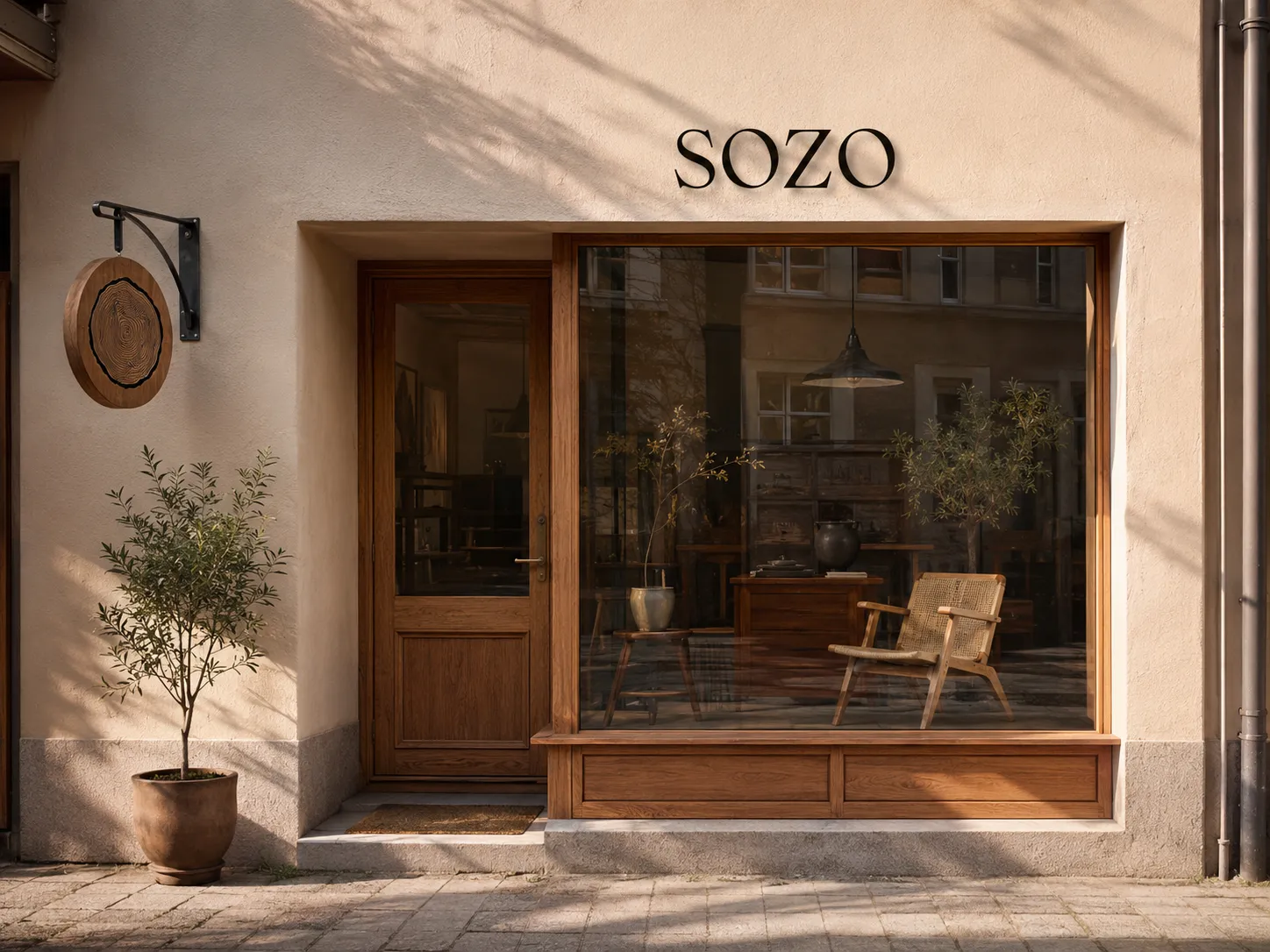
The letterforms give SOZO a distinctive presence across storefront signage and printed materials. The logotype is paired with the tree-ring symbol throughout the identity, while each can also be used independently.
A tree cross-section used as a maker's mark.
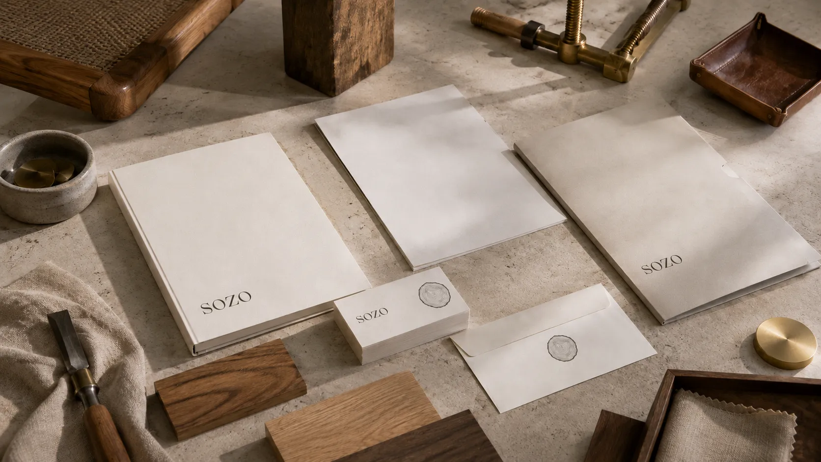
The symbol connects the identity to wood, material and the furniture SOZO restores. Its irregular rings create an organic form that can be used as a stamp, seal, carved sign and embroidered mark.
Three verbs describe the studio's services.
‘Rebuild. Restore. Renew.’ summarises how SOZO works with existing furniture, from structural repair to restoration and adaptation for continued use. It is used as a supporting statement alongside the identity.
Rebuild. Restore. Renew.
Colours drawn from wood, clay, textiles and workshop materials.
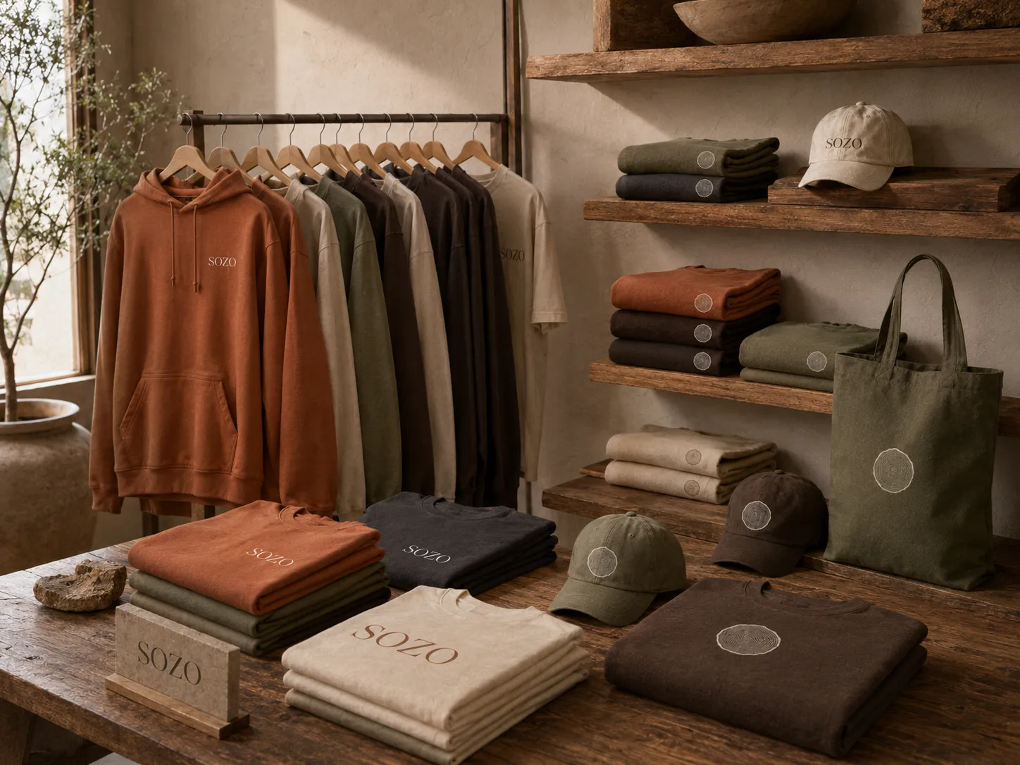
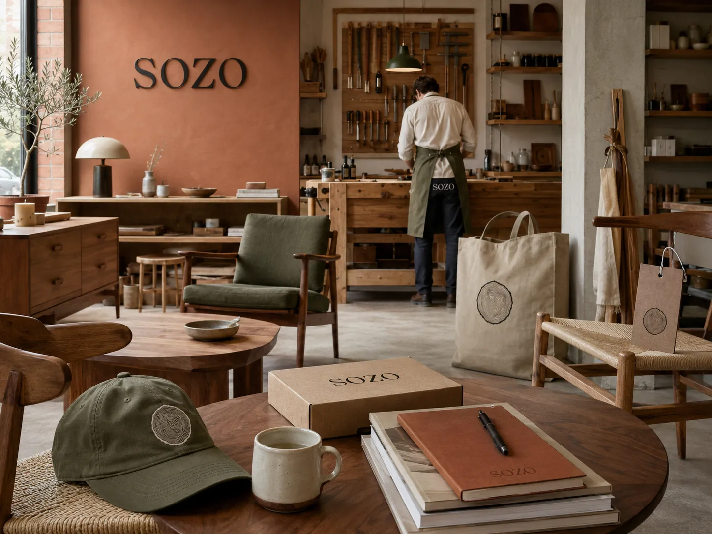
Terracotta and Walnut lead the palette, supported by Olive. Plaster, Jute, Bone and Char provide neutral backgrounds and text colours across print, interiors and clothing.
Brockmann for display and Outfit for supporting text.
Brockmann is used for headlines and prominent brand messages, while Outfit handles longer text and practical information. The combination creates a clear hierarchy across print, signage and digital applications.
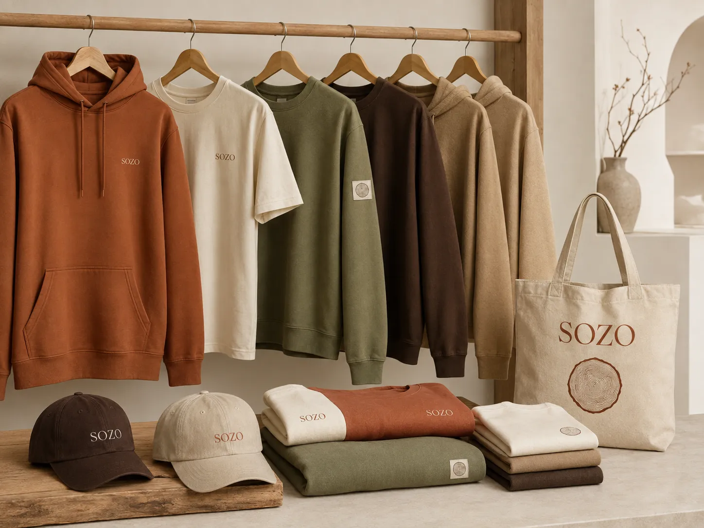
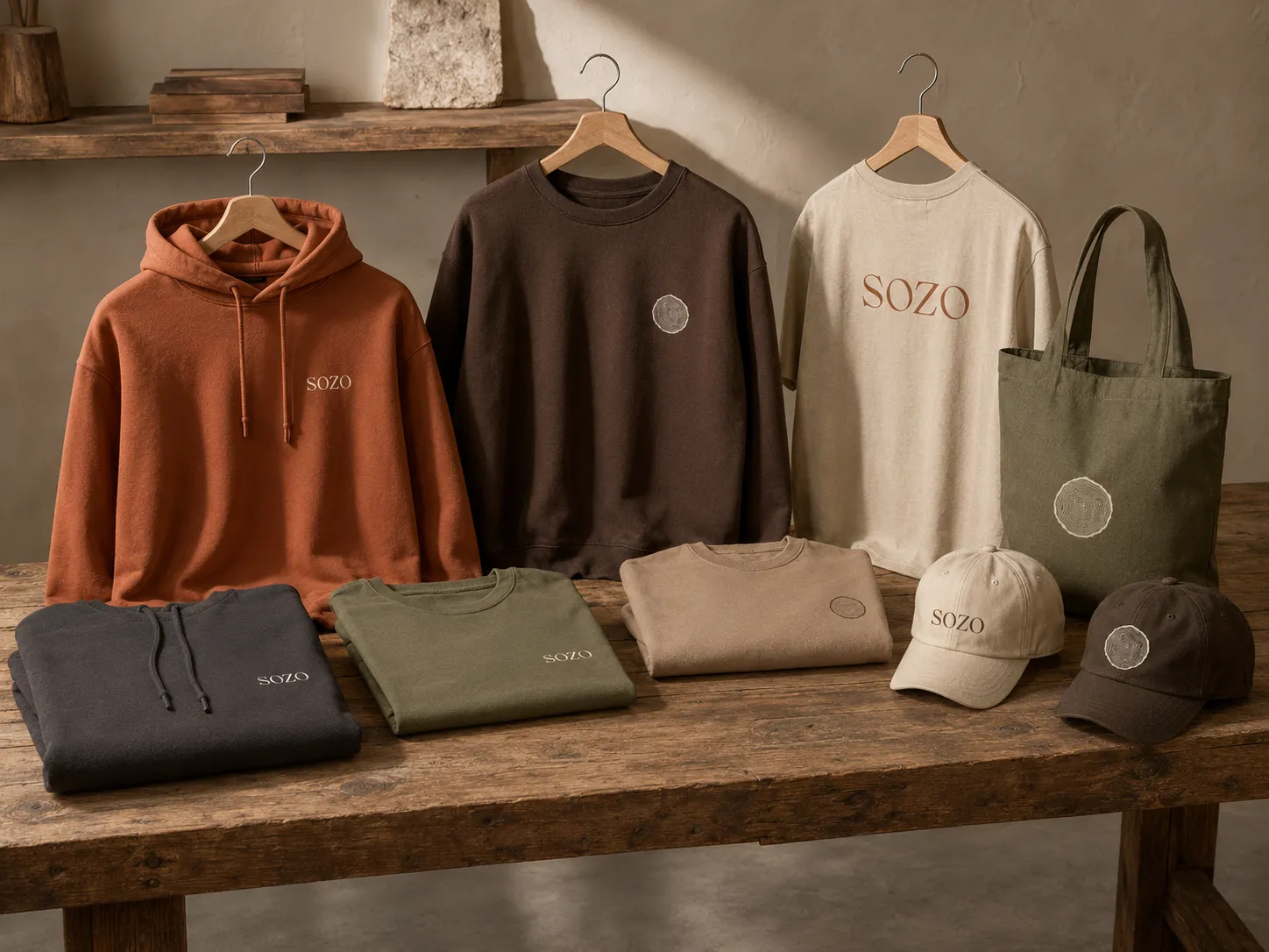
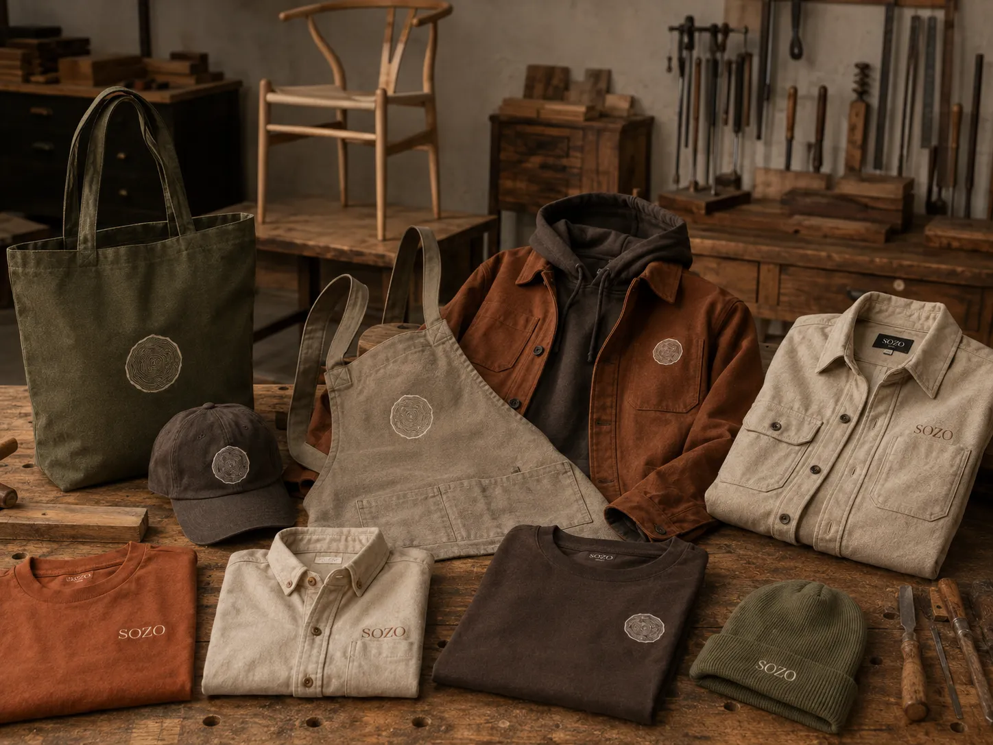
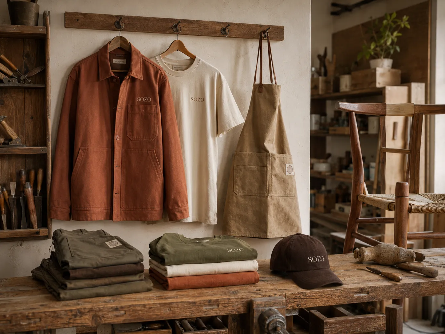
The identity extends across the studio, retail space and workwear.
The symbol is carved into signage, debossed on stationery, pressed into wax seals and embroidered on clothing. The colour palette is used across walls, printed materials and apparel, creating a consistent system from the storefront to the workshop.