Nacka Te & Kaffe Handel — Brand Identity
Creating the first complete brand identity for an established tea and coffee shop in Stockholm

The shop had been in business since 2002 without a coherent brand identity.
Nacka Te & Kaffe Handel needed a recognisable system across its storefront, products and communication. The project created its first complete identity, including the symbol, logotype, colour palette, typography, botanical illustrations and applications across the shop and its packaging.
A tea leaf and coffee bean combined in a single mark.
The symbol represents the shop's two main product categories within the same circular form. Its simple construction allows it to work independently at small sizes and across printed, engraved and digital applications.
Three versions for different sizes and applications.
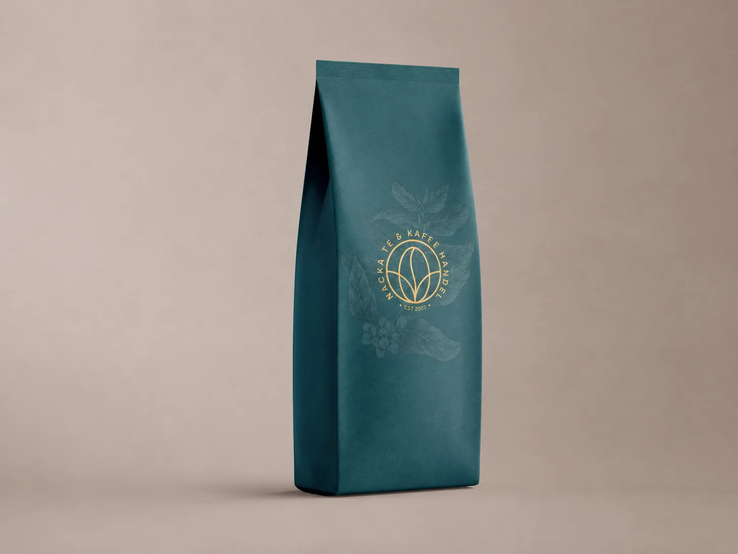
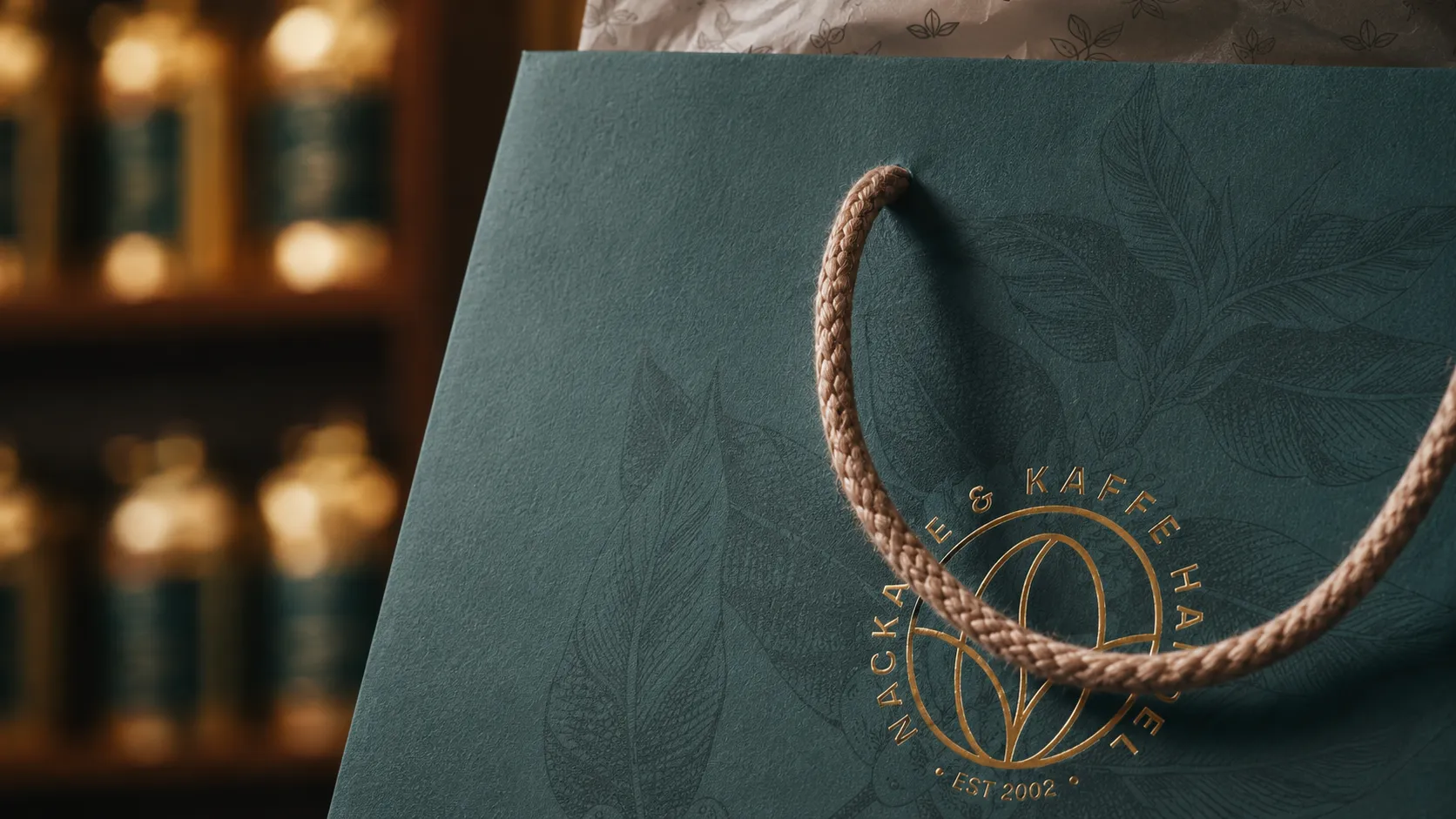
The system includes a full badge with the shop's name and founding year, a simplified stamp and the standalone symbol. Each version uses the same central mark but carries a different amount of information, allowing the identity to scale from storefront signage to small product labels.
A colour palette developed for the shop and its products.
Petrol is the main brand colour, supported by gold for key details and signage. Sage, caramel, cream and paper expand the palette across packaging and print while helping distinguish the coffee and tea ranges.
Two typefaces with distinct roles.
Sfizia is used for prominent brand moments such as product names and headlines. Borna handles descriptions, origins, weights, prices and other practical information. Together they provide an expressive display face and a legible typeface for everyday use.
Botanical illustrations for tea and coffee.
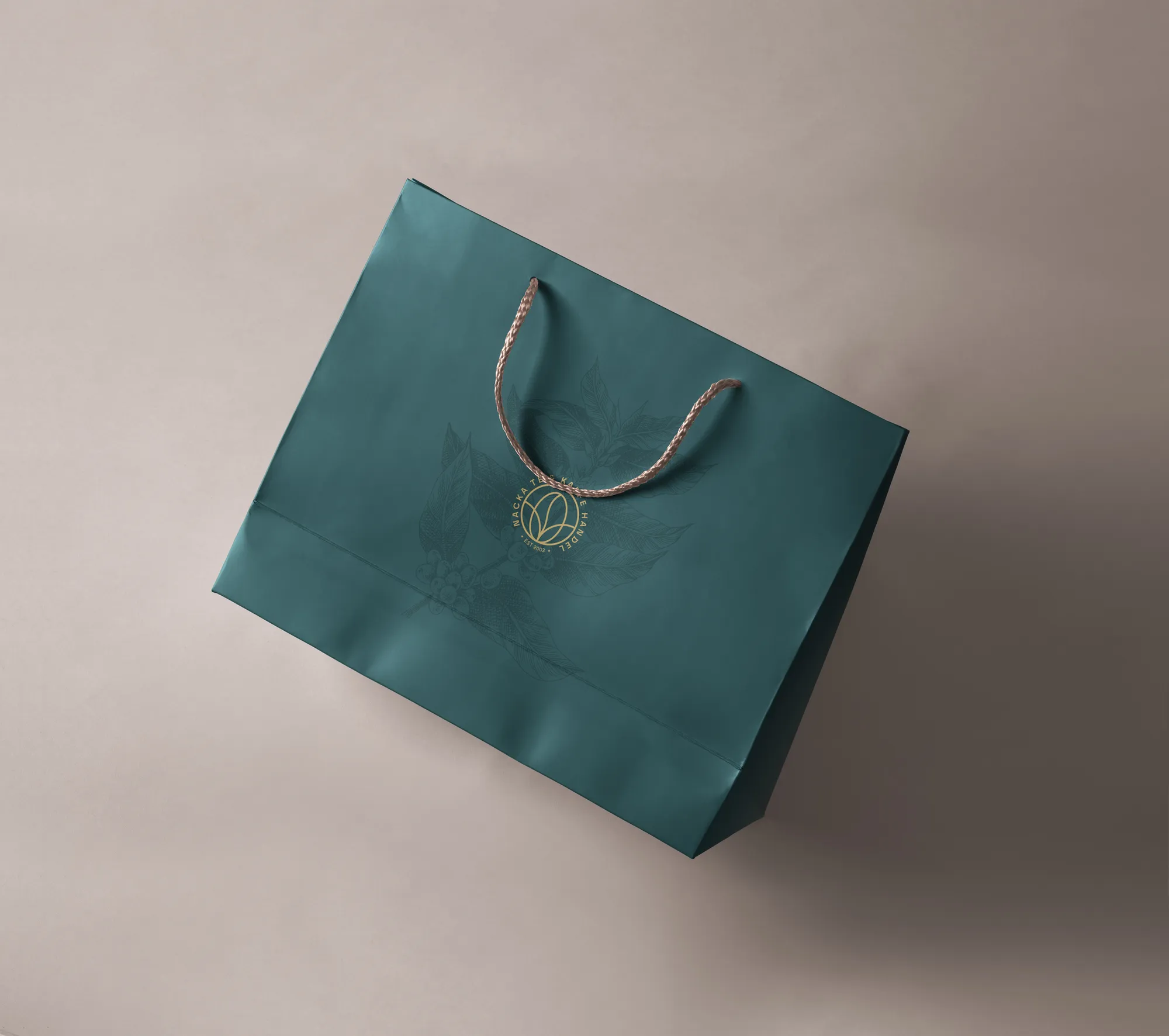
Three custom line illustrations depict a coffee branch in flower, a coffee branch with fruit and a tea plant. They extend the identity across packaging, bags and printed materials and can be reproduced as both foreground artwork and tonal patterns.



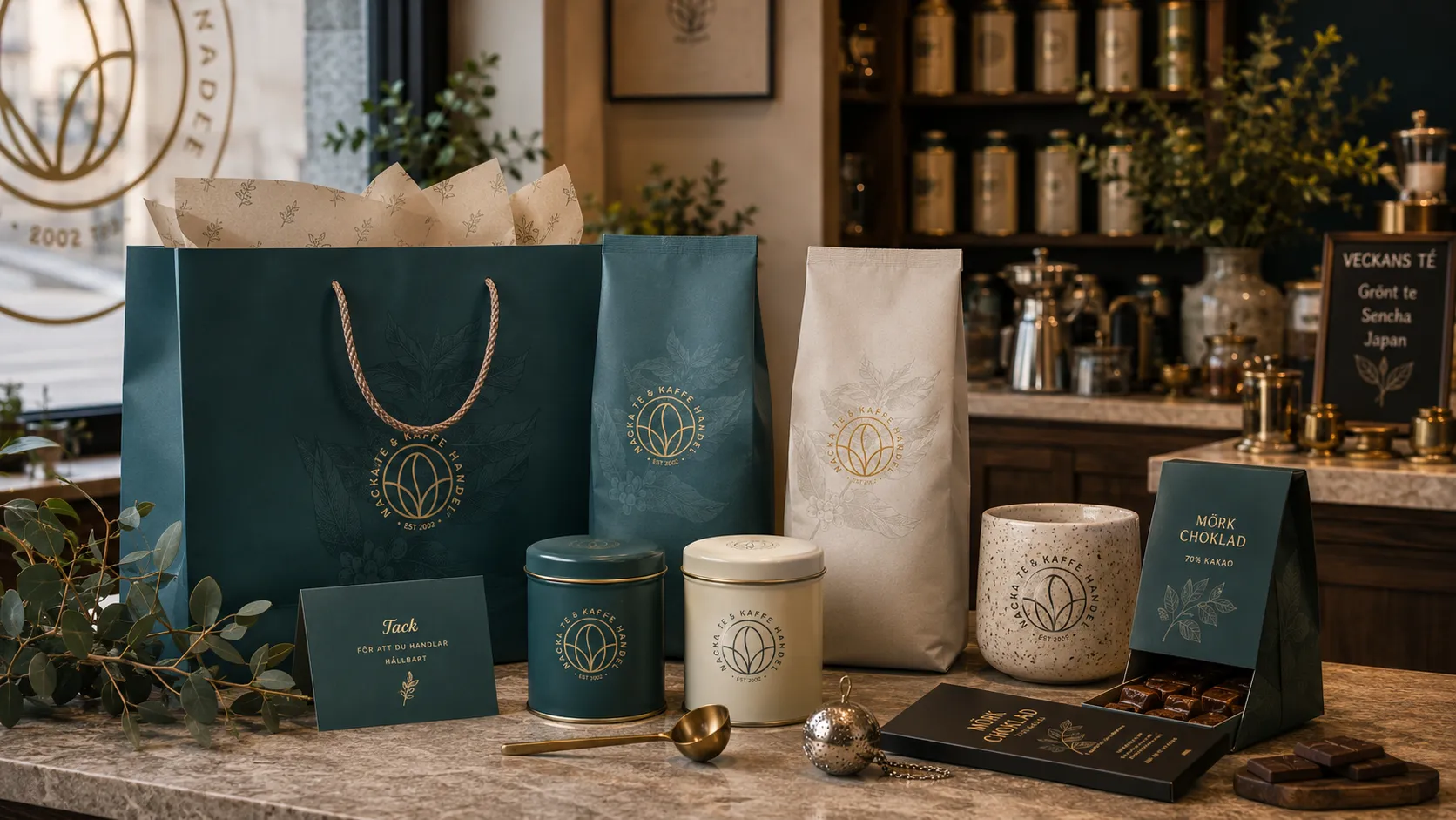
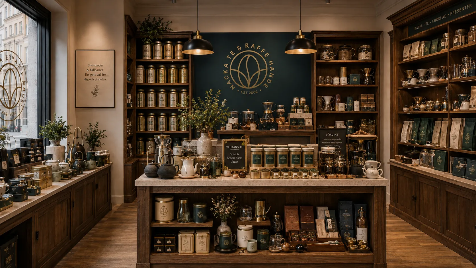
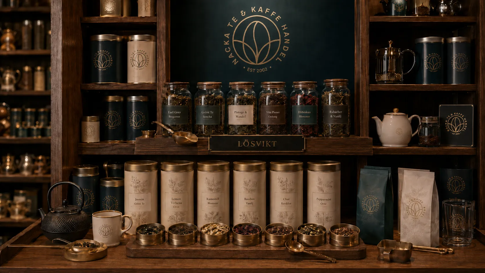
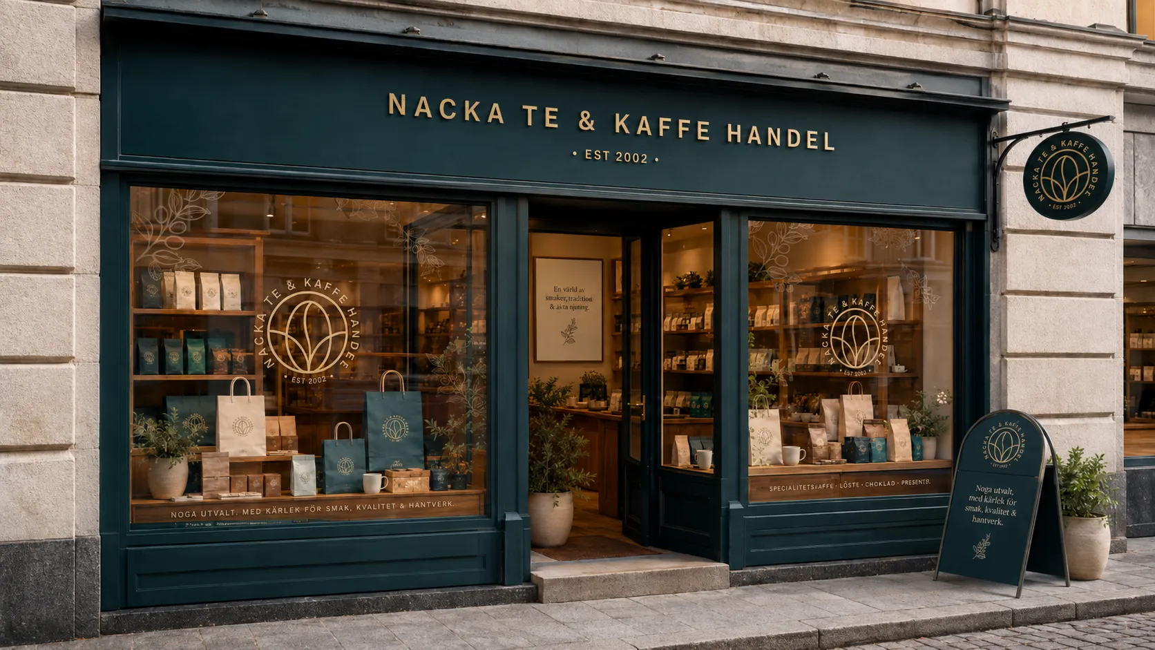
One system across packaging, signage and the shop.
Coffee and tea packaging share the same format and are distinguished primarily through colour. The badge, botanical illustrations, typography and material palette also carry into bags, labels, menus and storefront signage, giving every customer touchpoint a consistent visual identity.