Spontan — Brand Identity
A brand concept and visual identity for an accessibility consultancy
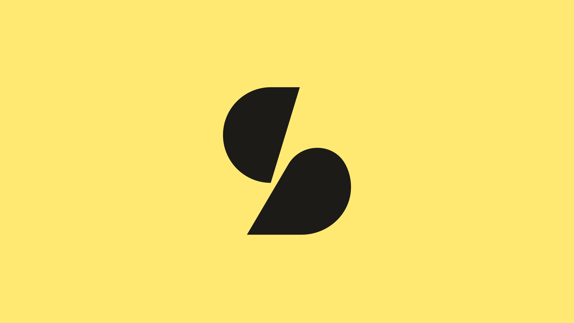
A visual identity for an accessibility consultancy.
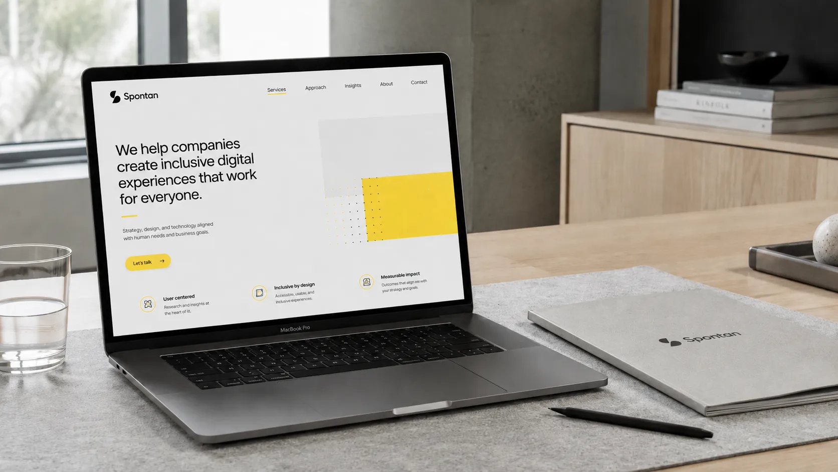
The project covered the brand concept, symbol, wordmark, colour palette and applications. The system uses a split S symbol and a high-contrast yellow and near-black palette across digital and physical formats.
Two shapes form an S.
The symbol is built from two separate forms that meet along a diagonal. It creates a compact, recognisable mark that can be used independently from the company name.
A flexible logo system for different formats and sizes.
The primary lockup combines the symbol with the Spontan wordmark. The symbol can be used on its own for avatars and stamps, while a simplified favicon handles the smallest digital sizes.

Yellow and near-black lead a high-contrast palette.
Yellow provides the main point of recognition, while near-black is used for text and the primary mark. Two cool neutrals support backgrounds and quieter layouts.
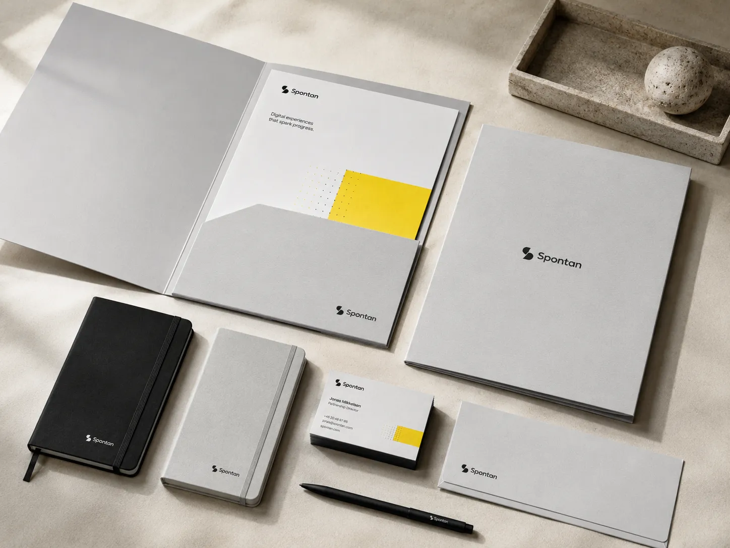
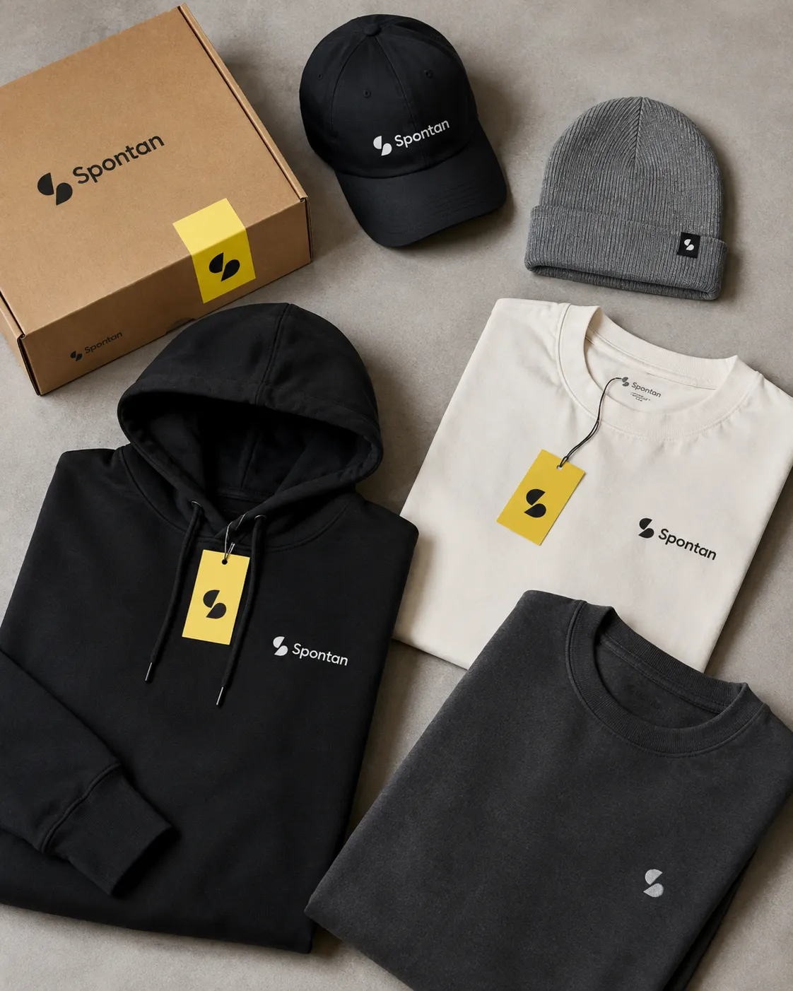
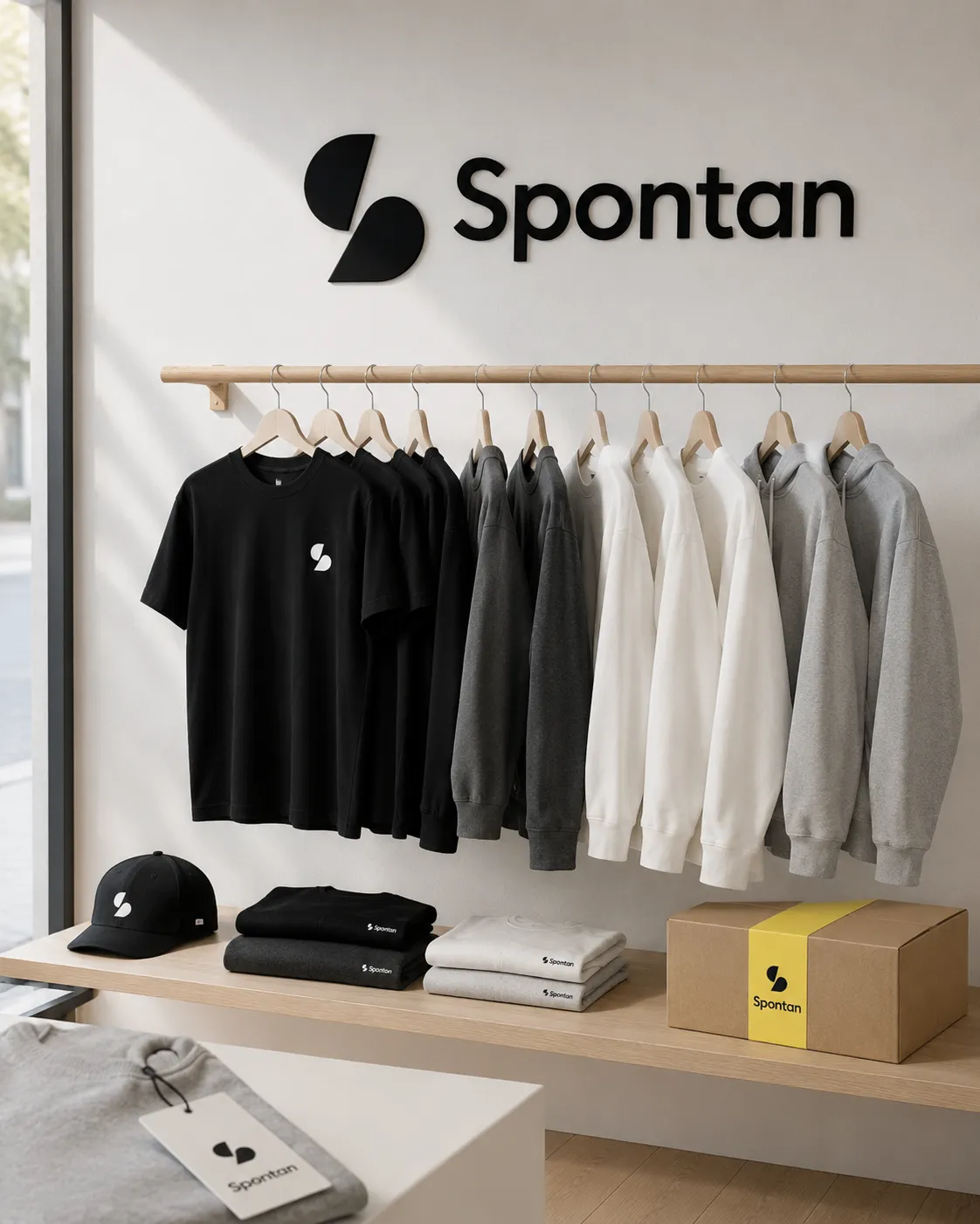
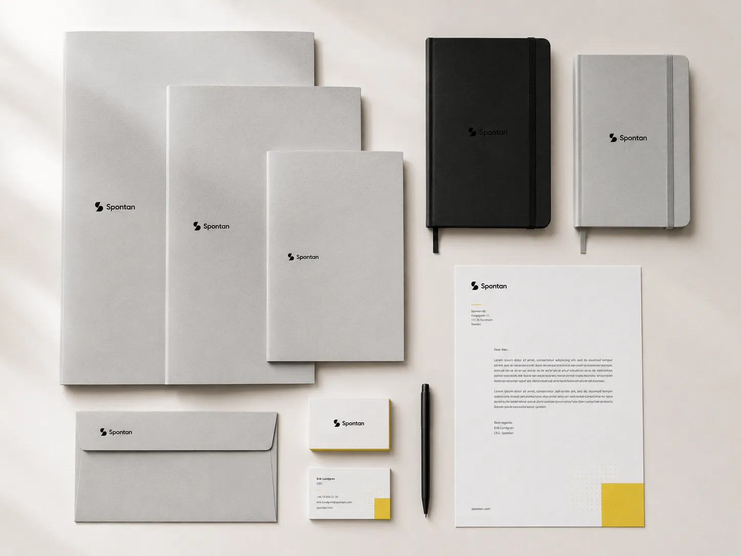
The identity extends across stationery, packaging, apparel and signage.
The yellow accent, split S symbol and wordmark are applied consistently across each format. The full lockup is used where space allows, while smaller applications use the standalone symbol.