Younio — Brand Strategy & Identity
A complete identity for a platform that brings brand strategy, guidelines and assets into one system

Younio is a platform for managing the connected parts of a brand.
It brings strategy, guidelines and assets together so teams can work from the same system. The identity was designed to express that structure across the product and every external touchpoint, from presentations and stationery to signage and merchandise.
Six outer points connected to a central core.
The symbol is based on a molecule, with six nodes representing the six pillars in Younio's model of brand anatomy. Lines connect each pillar to the core and create a compact mark for app icons, favicons, signage, print and embroidery.
A name built from ‘you’ and ‘unio’.
The name combines ‘you’ with ‘unio’, a word associated with union and bringing things together. The logo system includes the full lockup, wordmark, symbol and a simplified favicon for use at sixteen pixels.
A warm, neutral palette for a software brand.
Core and Cacao lead the identity, with Clay extending the warmer range. Nacre, Pearl, Ash and Paper provide neutral surfaces, while Ink is used for text. The palette works across product interfaces, documents and physical applications.
Silka for the brand, Silka Mono for technical information.
Silka is used for headlines, body copy and the main interface hierarchy. Silka Mono supports labels, metadata and technical details. Both families share the same proportions, keeping the typography consistent across brand and product.
A system designed for digital and physical use.
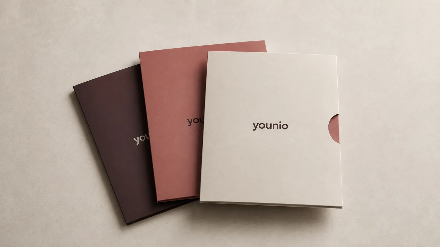
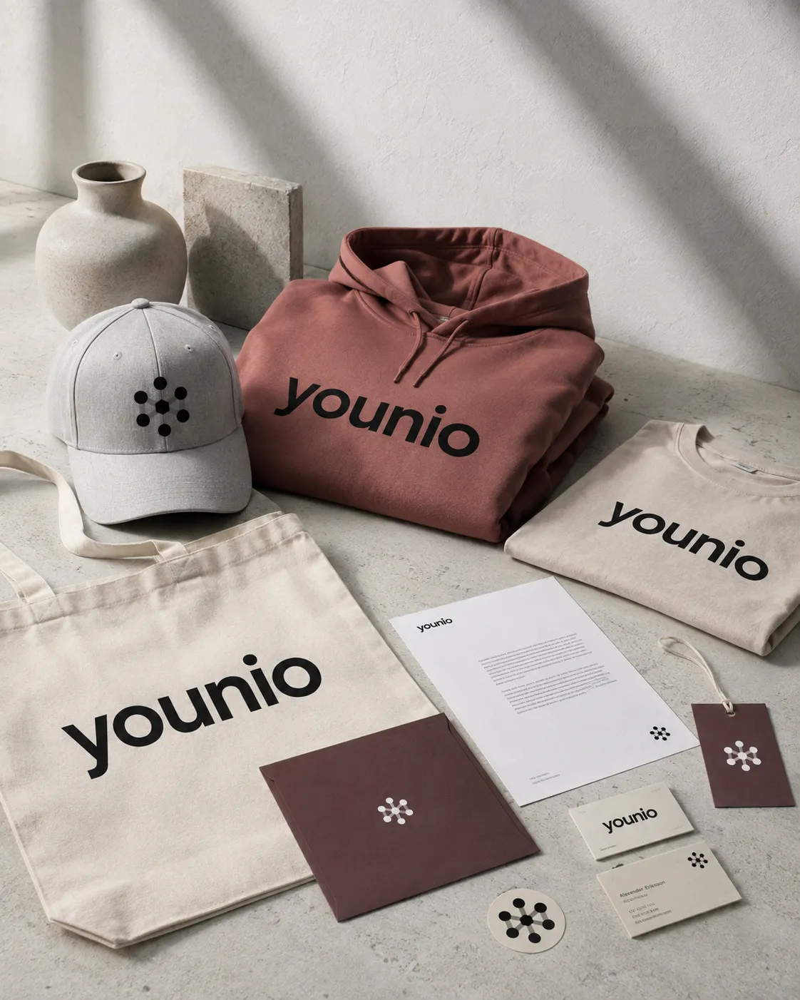
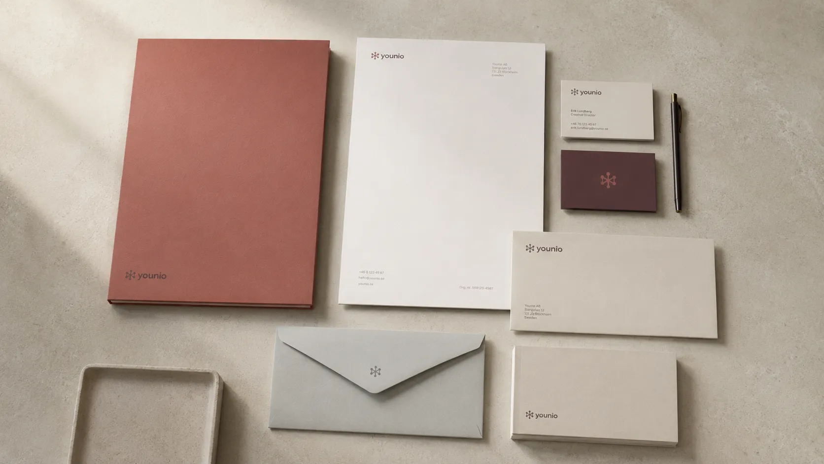
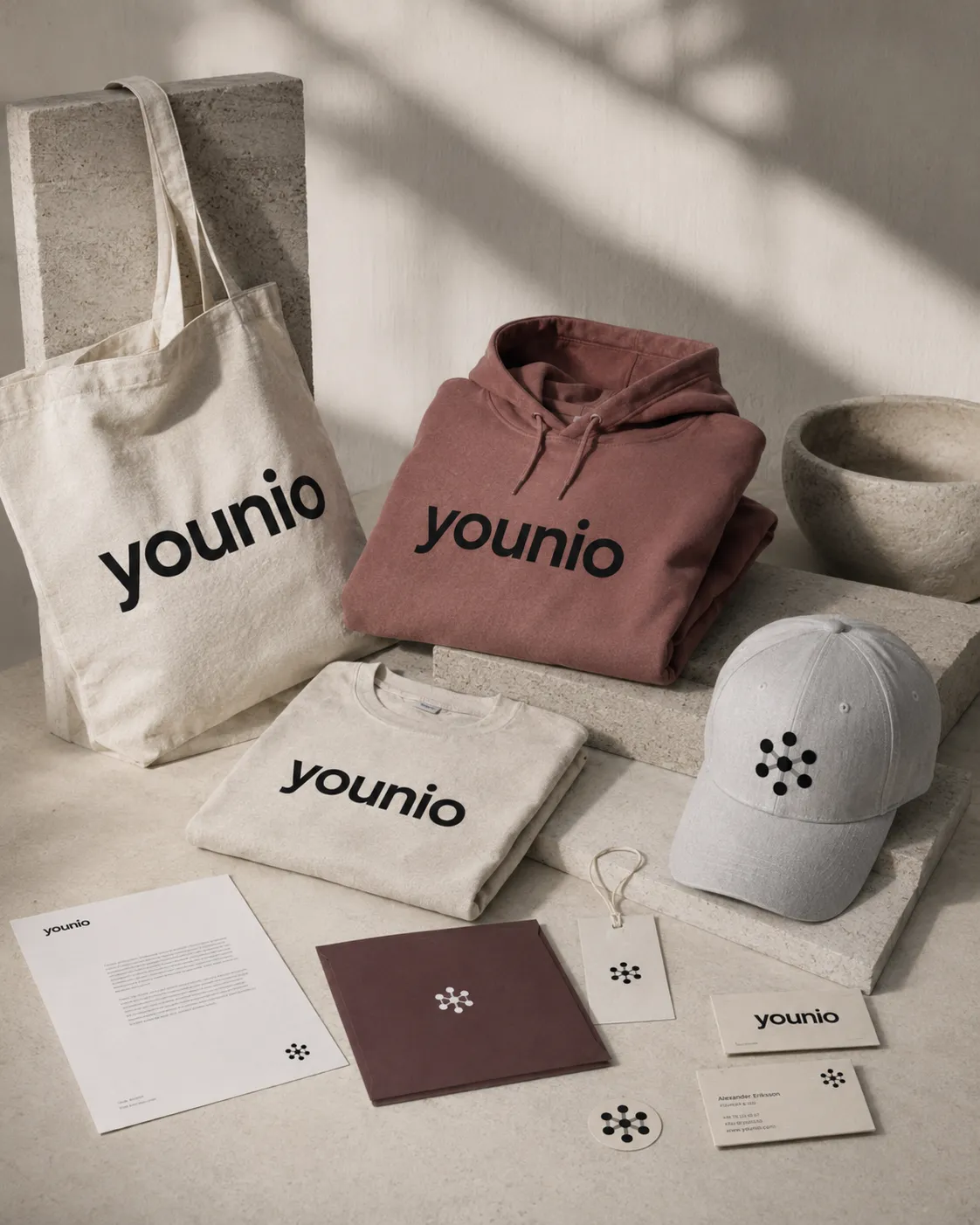
The wordmark and symbol are applied across stationery, presentations, slipcases, signage and merchandise. The symbol can be printed, embossed and embroidered, while the simplified favicon preserves the same form at the smallest digital sizes.