Shaky Shaky — Brand Strategy & Identity
A brand strategy and identity for a portable blender, built around one simple instruction: fill it, blend it, go

A portable blender brand developed from the name up.
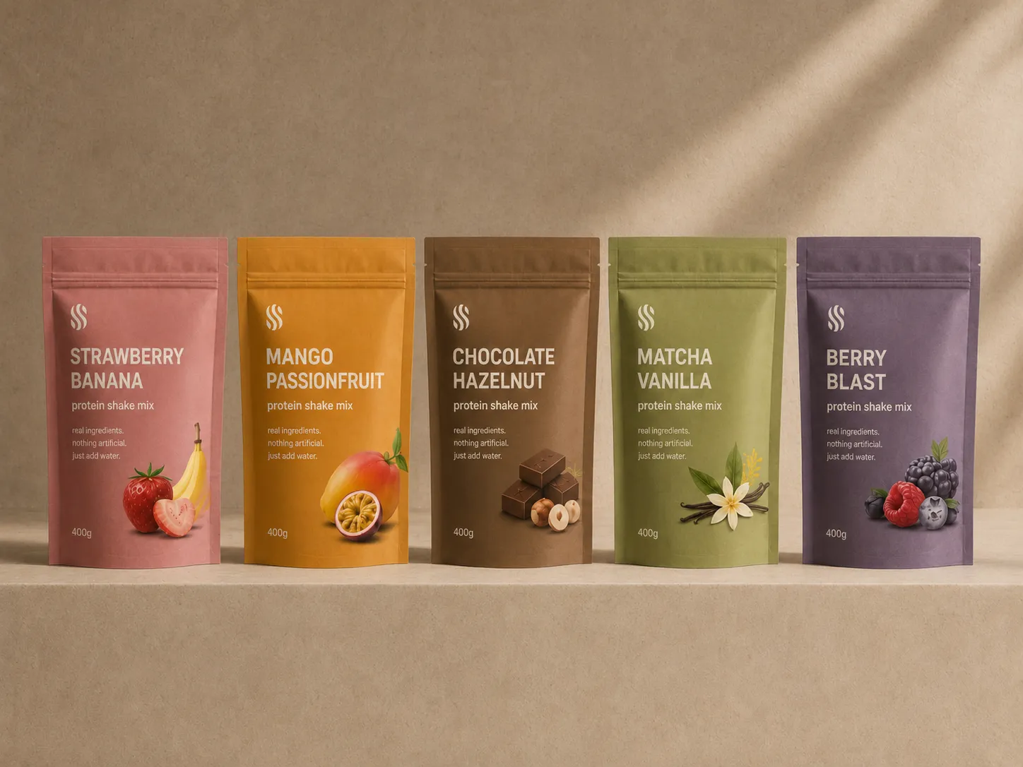
The project covered naming, strategy and visual identity for Shaky Shaky. The system brings the blender, packaging, retail environment and photography together through a warm, simple expression that keeps the product at the centre.
Two S forms create a single mark.
The symbol brings two mirrored S shapes together. Their curves suggest ingredients moving inside the blender and form a compact mark for the bottle, packaging, signage and digital use.
The name shakes. The lettering stays composed.
The lowercase wordmark balances the repetition in the name with a steady, straightforward form. The logo system includes stacked, horizontal, wordmark and symbol-only configurations for different scales and formats.
The identity is built around one permanent colour.
Ink is used across the wordmark, symbol, packaging and signage. White is used for reversed applications, while the transparent bottle allows the ingredients and finished drink to provide the changing colour.
Archia across product, packaging and retail.
Archia is used throughout the identity, from product details and packaging instructions to signage and campaign copy. Regular and Medium handle the main hierarchy, with the wider family available when needed.
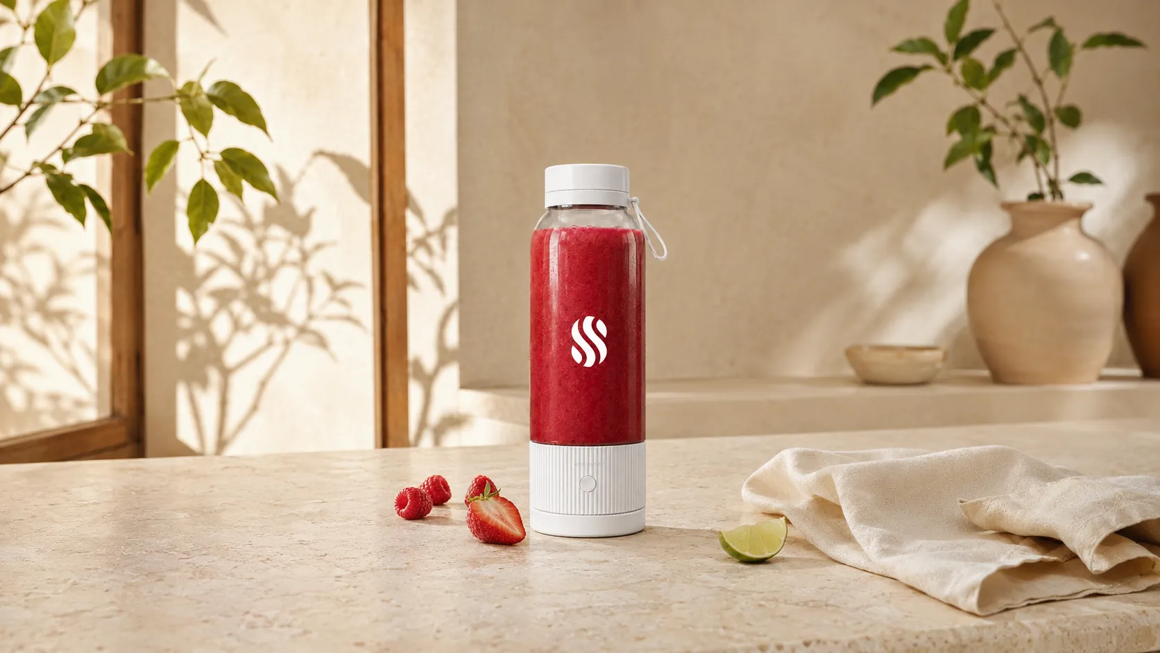
The identity keeps the blender at the centre.
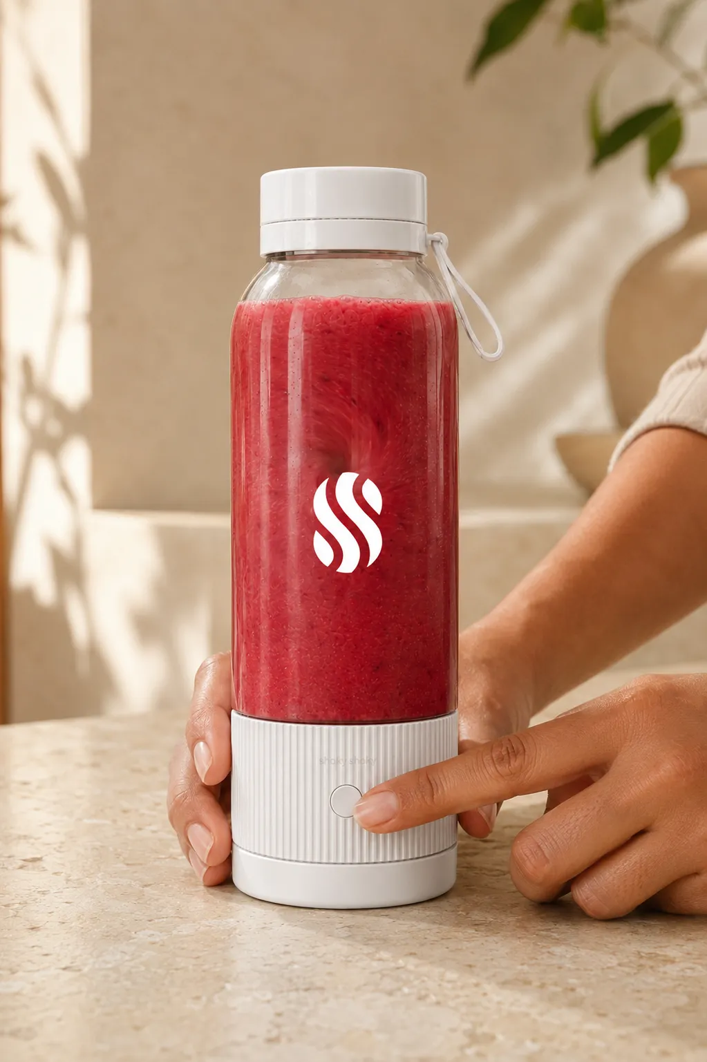
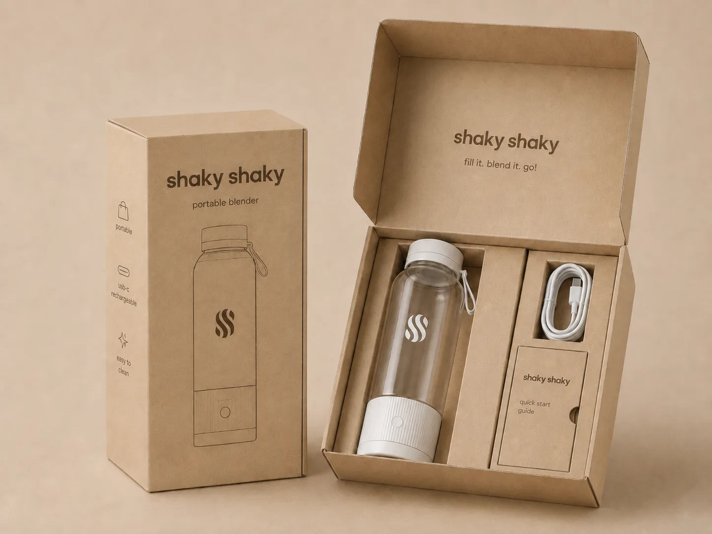
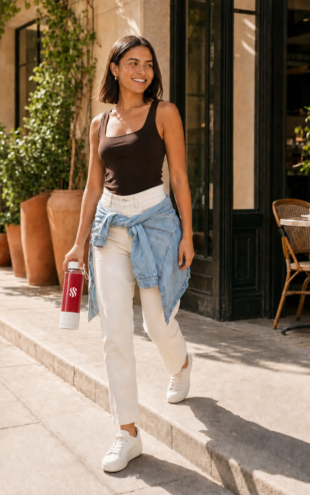
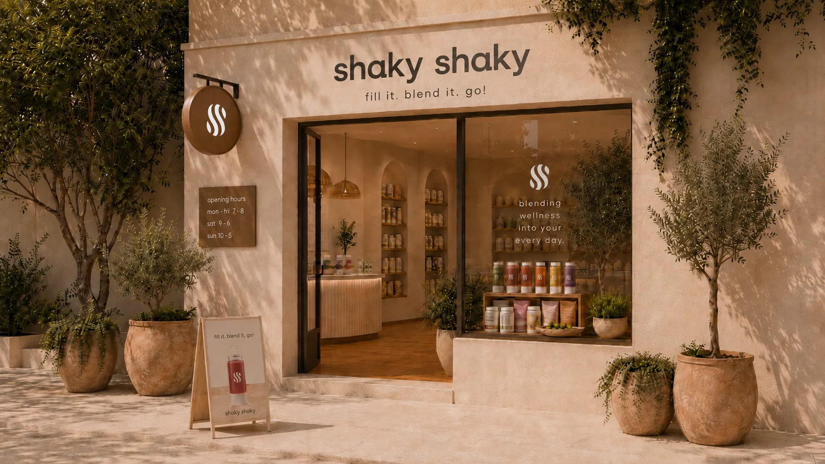
The symbol is applied directly to the transparent bottle, allowing the colour and texture of each drink to become part of its presentation. The same system carries across the product box, quick-start guide, retail signage and campaign photography. The line ‘fill it. blend it. go!’ turns the product's basic use into a simple brand instruction.