Taly — Brand Strategy & Identity
A brand system for a wellness organisation focused on healthier, more intentional living

Taly connects physical health, emotional wellbeing, finances and purpose.
The project covered naming, brand strategy and a complete visual identity for a wellness organisation centred on intentional living. The resulting system combines a human symbol, a bold violet palette, direct typography and black-and-white photography across events, campaigns, merchandise and digital products.
A human figure built from a circle and an open curve.
The mark can be read as a person with raised arms, a smiling face or a body in balance. Its simple construction keeps it recognisable across large event graphics, small digital icons and embroidered applications.
The symbol's curve is repeated in the wordmark.
The A carries the same open shape used in the symbol, connecting the name and mark without making them dependent on one another. Stacked, horizontal, wordmark and symbol-only versions cover different formats and sizes.
Violet is the primary brand colour.
A light tint and a deep shade extend the violet across backgrounds and applications. Ink, slate, mist and paper form the neutral base used for typography and quieter layouts.
One type family across campaigns, guidance and product UI.
Outfit is used in Regular and Medium for the core system, with additional weights available for display and supporting uses. Its range allows Taly to maintain consistent typography across event headlines, long-form content and digital interfaces.
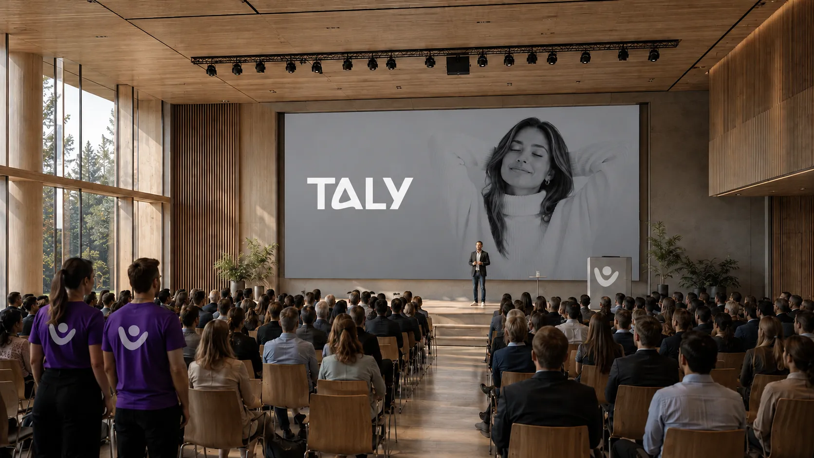
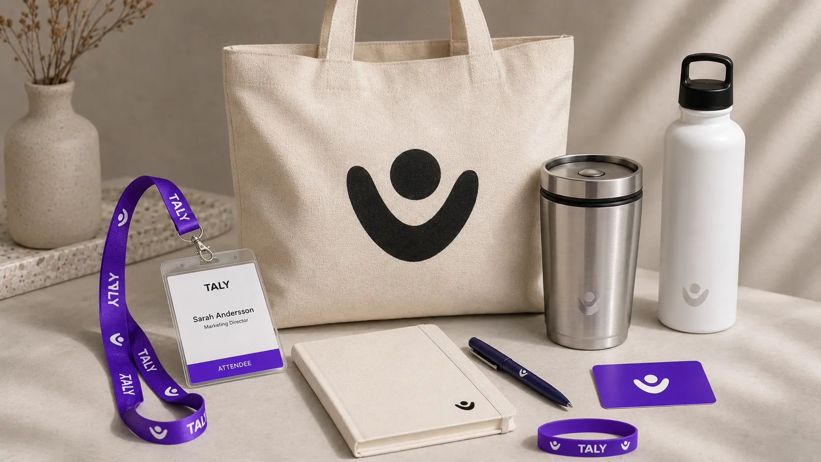
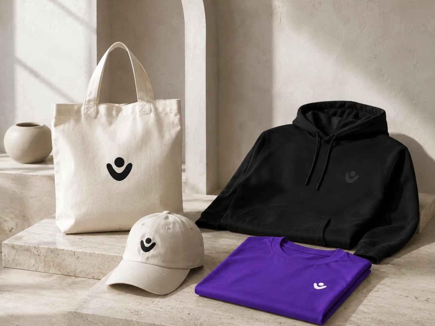
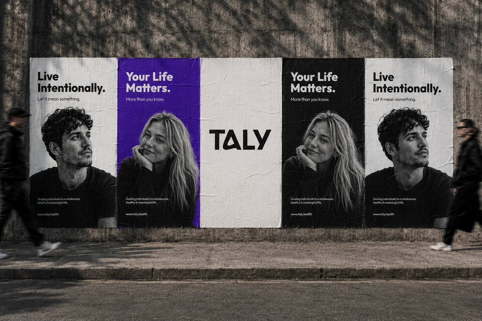
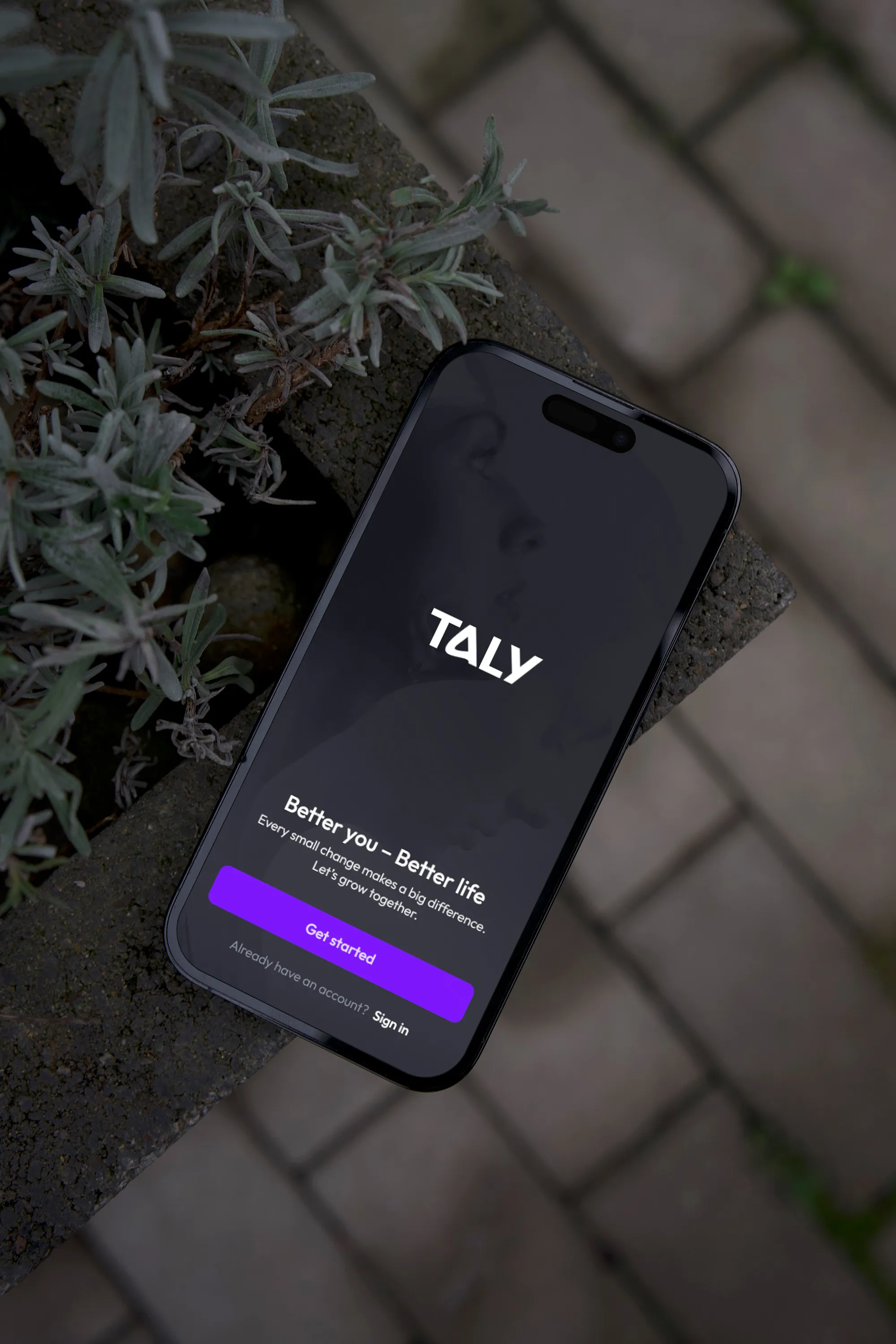
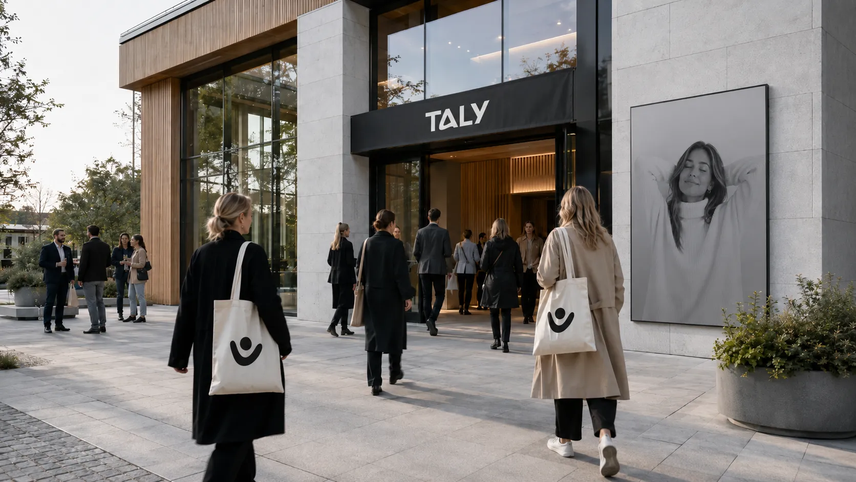
The identity was applied across events, campaigns, merchandise and digital products.
Large areas of violet, oversized typography and the symbol create visibility across stages and event materials. Campaign posters pair direct messaging with black-and-white portraits, while clothing and stationery use the symbol and wordmark at a smaller scale. In the digital product, violet identifies primary actions and the supporting colours distinguish different types of information.